Discovering Microsoft Windows 11 and its first beta
Microsoft allows its Insiders to test the initial beta version of Windows 11 and discover its new features. The developer hopes to obtain initial feedback from users and finalize certain choices. Here are our findings.
Installation Windows 11
The Windows installation process is for the moment strictly identical to that of Windows 10. We proceeded from a USB key with the same steps. The configuration has changed slightly and the settings for Cortana, Microsoft’s intelligent personal assistant, are still not included in the program.
This step had already been removed on Windows 10 21H1. New, Windows 11 will ask you to name your PC to avoid the Laptop-12ABCDE3 type names when you look for your PC on the network. This more is appreciable.
The Professional version does not require a Microsoft account unlike the Home version. The rest of the configuration procedure does not change since it is necessary to accept or refuse the various requests to send data to Microsoft or targeted ads.
The PC finally restarts on a waiting screen with blue halos. After a few seconds, here we are on the Windows 11 Desktop.
Upgrade windows 11 now > Upgrade
Brand new interface
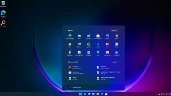
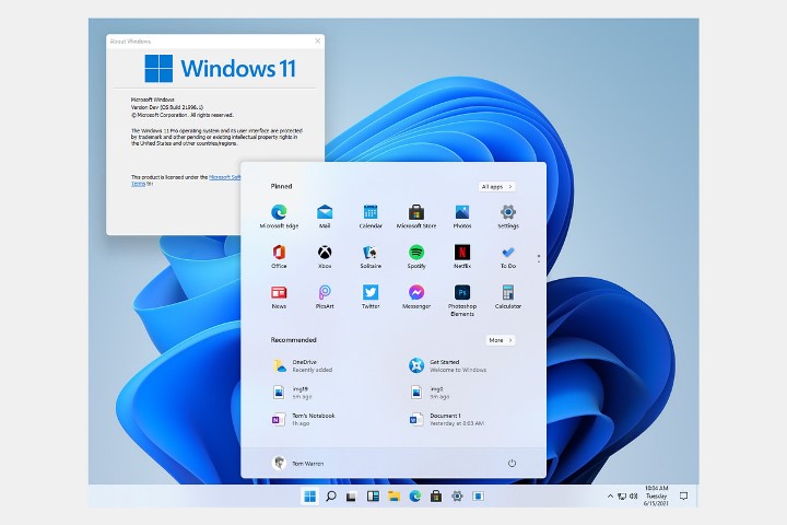
We discovered it when getting started with the leaked preview before Microsoft announced: the Start menu is now centered on the bar by default and the window corners have been rounded. Who says new visual identity, also says new sound identity.

All the sounds (start-up, notifications, etc.) have been reviewed and are very discreet, if not too much. Clicking on the Windows button brings up the new Start menu. Exit the tiles, place two sections: the applications pinned to the upper part, then the recommendations.
Applications Windows 11
In Pinned, we find our applications. Formerly tiles, they are now icons that can be selected for direct access. An All applications menu lists all installed programs, while the Our recommendations section displays recently installed applications or the most recently opened documents.
Right-clicking the Start button always brings up the same system settings and tools, such as task manager and shutdown options.
Start Button
It is obviously possible to install the Start button on the left of the taskbar, but the latter is no longer movable and will remain in any case at the bottom of the screen.
Using the Start button centered on the taskbar, we noticed that it shifts slightly to the left each time we open a new app. So that after opening a dozen programs, it is no longer in its original place and can generate click errors.
Explorer Made Simple
Windows 11 File Explorer has also been simplified. The headband present in its predecessor has indeed been completely revised. It must be said that on Windows 10. This banner had inherited various changes from previous versions and was starting to become a real little readable tote.
Microsoft has therefore removed the entire banner to leave only the essential in the form of icons and without labels. We note the appearance of a button with three points Learn more which allows access to the options removed from the banner. When you are at the root of the storage unit, it even brings up the Clean, Optimize or Format options.
Context Menu
The context menu, which appears via a right-click, has undergone the same slimming treatment. Thus, all the options that the software could install are relegated to a Show more options submenu containing the right-click context menu of Windows 10.
Finally, a nice little detail, an active application displays a small dot under its icon in the taskbar. And if this application performs a task in progress, for example a photo processing or a file transfer, said pad then turns into a miniature progress bar. This is reminiscent of a certain Apple macOS.
Improved Multitasking
To improve multitasking, Microsoft has implemented Snap Layouts, or anchors in the language of Molière. These are preconfigured window layouts that allow you to neatly place your windows and applications on the desktop so that they are all visible.
To access this function, hover over the Maximize button in a window to take advantage of the different possible layouts. Their number varies depending on the definition of the screen. Once the layout is selected, the tool guides the user to place the windows one by one. You can also call this function with the Win-Z keyboard shortcut.
Docking windows 11
Another novelty is “docking”. This very practical option allows Windows 11 to manage the connection and disconnection of a second screen while keeping the layout of the windows from one configuration to another.
So if you’ve placed four apps in each corner of your second monitor’s desktop and unplugged it, windows will automatically minimize to the taskbar and return to their original place when you connect the monitor again. You can also define if the applications are reduced or migrated on the main screen.
A Desktop button appears in the taskbar between those of search and widgets. This allows you to create and access Virtual Offices more easily. It is now also possible to apply a theme for each of these in order to better identify them.
The return of widgets
Oh joy, widgets are back! Please note, these are not Windows Vista floating widgets. In Windows 11, they are confined to the left of the screen within a banner. You can call them up by clicking on the dedicated button in the taskbar or by using the Win-W keyboard shortcut.
At the moment, the list of widgets is relatively limited with a calendar, a todo list , tips, traffic, weather or sports scores. The customization is more or less advanced depending on the widget. Thus, all these widgets appear on the upper part of the window, while below a customizable news feed runs almost endlessly.
Hopefully the developers will come up with more interesting widgets, because at the moment this window doesn’t differ much from an information portal like Bing’s.
More intuitive settings
Microsoft has finally reworked its settings panel. The previous menu introduced with Windows 8 did indeed have a taste of unfinished business and existed in the shadow of the Control Panel.
This redesign makes it easier to find the parameter you want to change and, above all, the user no longer gets lost in the different menus. The route taken is displayed at the top, the settings categories on the left and the home page offers a summary of the PC with the most common settings.
New tools are welcome, like a new battery manager for laptops. Finished, the modes of feeding which one did not really know what they were doing! There is only one power saving mode left, which activates at 20% battery capacity.
Quick Settings
Quick settings are also appearing in the taskbar. Clicking on the wifi, sound or battery icon pulls down the menu. Microsoft is also largely inspired here by what is done in the competition. It is thus possible to adjust the volume and the brightness. And now up to 12 buttons allow you to swap features like wifi.
Bluetooth – finally! -, airplane mode, etc. The Win-A keyboard shortcut will bring up these quick settings, and those who used it to bring up notifications will now have to crack a Win-N.
Welcome improvements in typing
In Windows 11, new three and four finger gestures are emerging. By sliding three fingers on the touchpad from top to bottom, all windows are reduced / enlarged.
A three-finger swipe left or right allows you to switch from one application to another.
With four fingers, it is in the virtual offices that we will be able to navigate. A down gesture also minimizes windows, while a four finger up gesture displays the task view (Win-Tab), a horizontal gesture for navigating between Virtual Desktops.
Voice Input Improved
Voice input has also been improved; the easiest way to activate it is to use the Win-H keyboard shortcut. Once on the way, you will have to enter this shortcut each time you want to use it. In the settings, it is possible to activate it permanently and to add the consideration of punctuation.
For use in tablet mode, virtual keyboards are also revised with new themes and more customization at the display level to avoid hiding interesting content.
Identical performance
We evaluated the performance of our Asus Zenbook 13 Oled Laptop PC (UM325UA) after its upgrade to Windows 11. To do this, we subjected it to the same tests that allow us to calculate the performance index of the processor.
And, for now, Windows 11 doesn’t make any changes. On all the benchmarks and application tests that we apply, the results are almost identical and neither of the two operating systems takes precedence over the other.
Aesthetic and Handling tweaks
At the time of judgment, this first beta of Windows 11 offers only aesthetic and handling tweaks. As well as a few new features, such as widgets that were not necessarily clamored for by users.
We note the absence of some features yet announced such as the compatibility of Android applications. The dynamic refresh rate or the integration of DirectStorage for players.
It will also be necessary to wait for the various manufacturers to offer drivers dedicated to Windows 11. In order to benefit from its latest improvements, which should not be long after the release of this beta version.
Microsoft therefore still has a few months ahead of it to refine Windows 11 before the release slated for fall 2021. It is very likely that we will be entitled to improved versions by then.
See Also : Whats G Hub for Logitech?
